A little background
The Toronto Video Atlas of Liver, Pancreas, Biliary, and Transplant Surgery launched in 2011 with a small selection of cases: Living donor left lobe hepatectomy, extended right hepatectomy with in situ, and in situ cold perfusion technique. From then on, our atlas has continued to grow at a steady pace. Initially, we released 3-4 new cases per year. After a few years we increased our output to 6-7 new cases per year, and since 2016, we have released a new case every month, totalling at about 65 cases and counting.


New chapters
As we continue to build upon our collection of HPB (Hepato-pancreato-biliary) and transplant videos, we are looking to expand into other surgical specialities. Last year we were approached by a group of OB-GYN (Obstetrics and Gynaecology) surgeons based here in Toronto who share our passion for education and communication. Things quickly lined up and we have officially started our collaboration this year. We are happy to announce that new OB-GYN cases will be released every two months, while at the same time new HPB cases will continue to be released monthly.

New logo, new website design
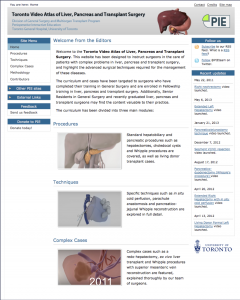
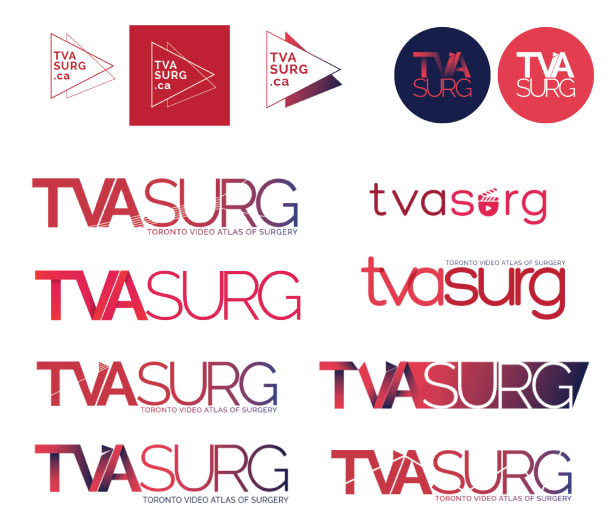
With the addition of OB-GYN content, we realized our logo featuring a liver is no longer sufficient to describe our growing atlas. It's time to rebrand ourselves from “Toronto Video Atlas of Liver, Pancreas, Biliary, and Transplant Surgery” to “Toronto Video Atlas of Surgery”. Our new brand reflects our ultimate goal for the atlas - to expand and become a video atlas of all surgical specialities. We are excited for the opportunities to collaborate with surgeons who share our values and passion for surgical education.
Before we hit the drawing board to create our new logo, we brainstormed words that described our brand and put those words into Google image search. We noticed it was easy to find logo inspirations for words like “video”, “filming”, “surgery”, and “education” but it was harder to find logos for a combination of surgery and education or surgery and filming. Our design challenge was to combine surgery, education, videos all in one logo. It had to be simple but original, represent our creativity and passion to innovate surgical education.

We experimented with a variety of concepts including suture silhouettes and CT slices. One of the concepts that popped out for us was the surgical scalpel. It is a surgical tool that is used in every surgery and in almost every opening shot of our videos. The letter “V” in the final logo is nicked by a scalpel resulting in a shape reminiscent of the “play” button that everyone is familiar with.
We also wanted to expand our colour palette to reflect our growing atlas, and at the same time complement our existing aesthetic. We chose to keep our signature red colour, but have added a purple hue to diversify the possibilities of presenting our brand. Additionally, use of a smooth gradient from purple to red also represents oxygenation of blood in the human body.

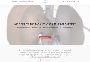
In addition to the logo, the structure of our website is also updated. You can now browse and find cases either by surgical specialities, or by anatomy. We hope you like our new brand and continue to support the evolution of our atlas. Please follow us on social media or subscribe to our monthly newsletter to stay updated.
