In this post and accompanying video, TVASurg production member Paul Kelly will show how you can use DaVinci Resolve for animation using the node-based compositing part of the software, Fusion. We've used DaVinci Resolve for video editing at TVASurg for several years now, and have utilized Fusion for compositing on several recent animations such as the Scapula Flap Harvest for ENT surgery, and the Segments 1/6/7 Ex Vivo Liver Resection with Veno-Veno Bypass for Caval Sarcoma case.
While Adobe After Effects has long been the standard software for animation compositing, DaVinci Resolve Fusion can also be used for 3D render sequence compositing, and 2D animations as well. If you have some experience with editing video, the node compositing system of Fusion might be a new system to you or you might be familiar with building node trees in other applications, but either way, I've really come to enjoy building animations with these flowchart-like node trees and we think you will too!
Why use nodes instead of layers? Flexibility and better visualization of the comp. Nodes can be reused and connected in ways that layers can’t. Layers have defined relationships based on where in the stack they are, whereas nodes can behave more non-linearly. We can also see the entire node tree laid out at once and understand how the nodes are affecting one another better than with layers where you might not be able to fit the entire layer stack in your UI without scrolling, you can’t have precomps open simultaneously, and you wouldn’t know right away what’s affecting what. Nodes allow us to make changes in what would otherwise be accomplished with pre-comps. By eliminating pre-comps, we stay in the same working space and don’t have to travel as far to jump over to connected assets or effects.
Part 1: Demo shot in AE
We're going to start with a demo in Adobe After Effects, as that’s the industry standard when it comes to compositing animation, and then we’ll jump over to Fusion and show you how to achieve the same result.
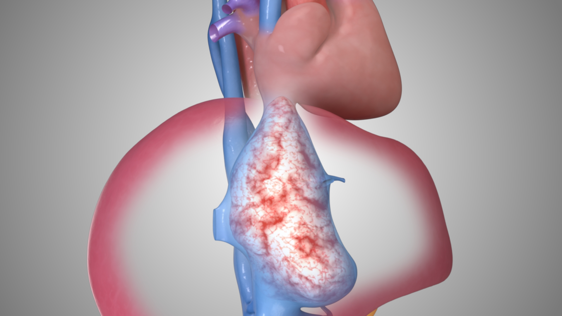
Basically what we're doing in this shot is compositing three different takes. The purpose of this shot is to show a tumour inside the vena cava which has started to enter the right atrium of the heart–the main reason why this patient needs surgery. So we have two layers of selective transparency happening at the same time. We want to show the sarcoma inside the vena cava, and this semi-transparent cava inside the liver. Here’s what the final shot looks like:
Let’s start by going into After Effects and I’ll show you how I’d make it there first in a more familiar environment. I bring in my rendered image sequences and place each of them into their own comp where I make my adjustments with render pass layers like multiply some AO if I want or Screen the Reflection pass, that sort of stuff. I’ll combine these precomps into a new comp, and on the precomp layers I’ll draw some masks for where I want the transparency to happen.
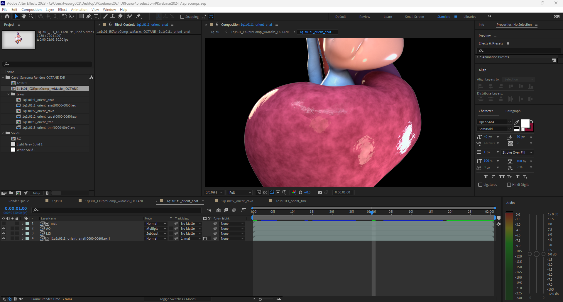
I’ll look at where the shot starts and ends, and draw out a mask with the fewest points possible, knowing that I’ll have to re-position these points for the start and end and have them stay in the relatively same area. Let’s see how that plays out. OK, now I’ll add some key frames to the mask shape in between to smooth that out.
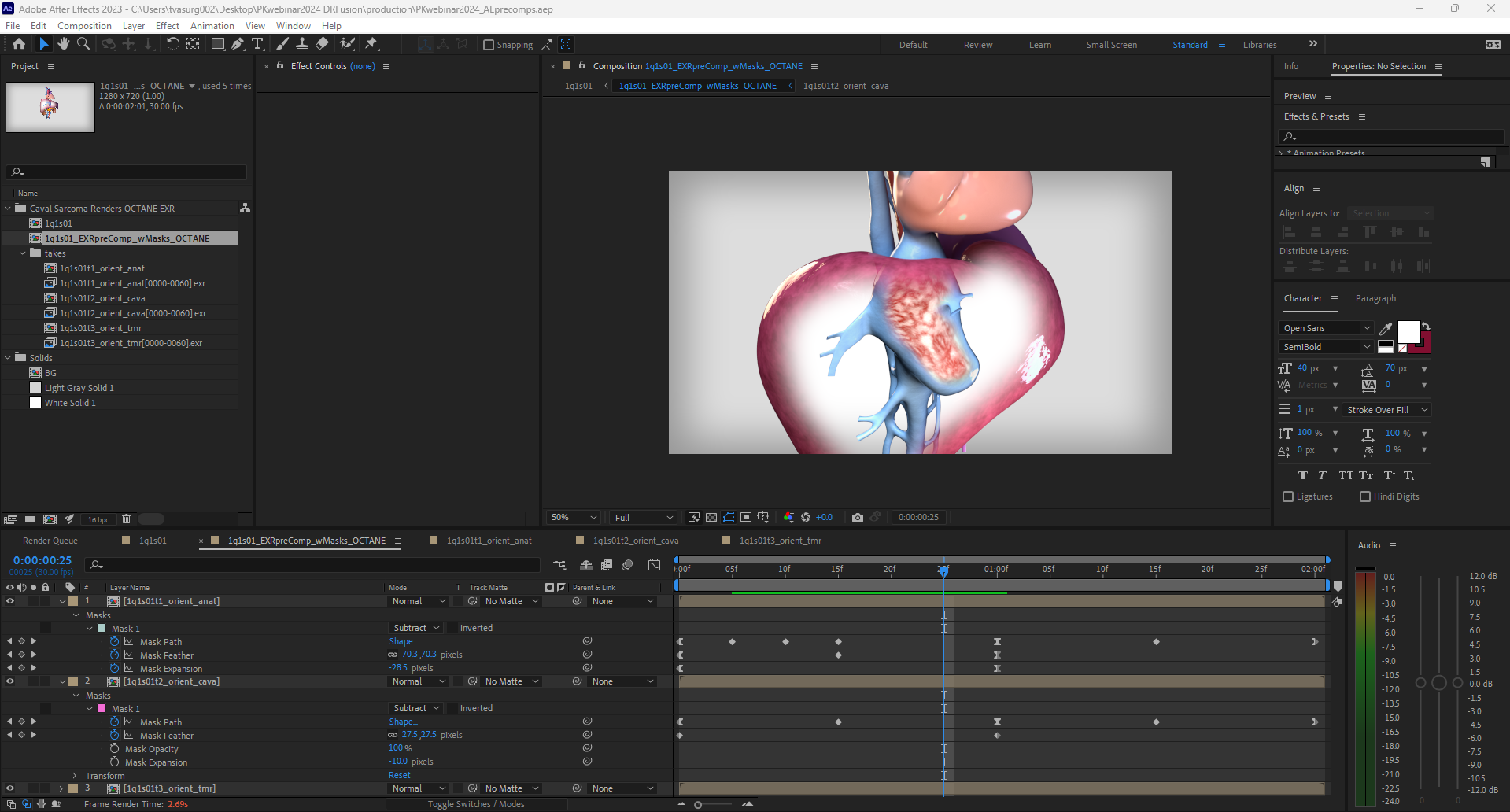
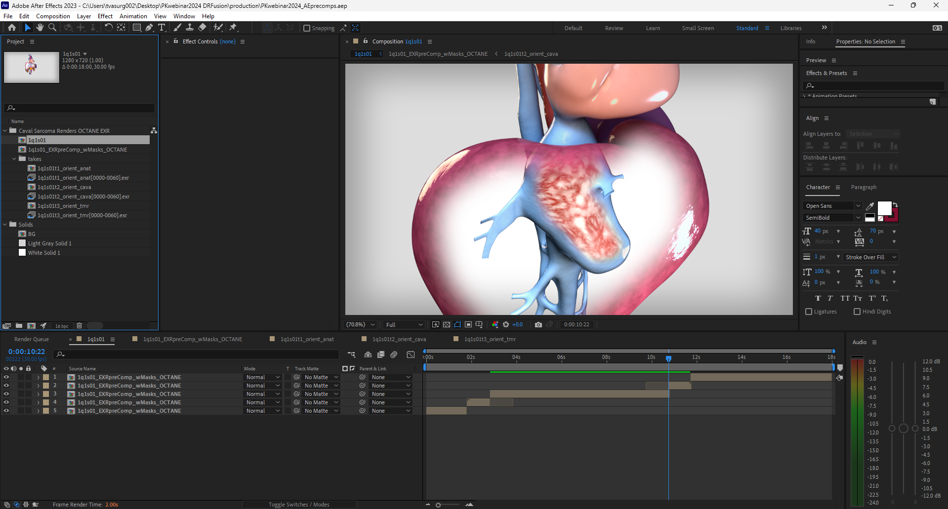
With these 3 layers masked out, I’ll pre-comp this again to set the freeze frames, this is to match the narration and give pauses for the labels, and the sequence is all set. Here’s the final result:
PART 2: DEMO SHOT in DR
So now let’s go into Fusion in DaVinci Resolve. First I’ll give just a very quick overview of the main components of the software. When we open DR we get the Project Manager window, here we can start a new project, or import a .DRP project file if you've been provided with one (if you do, the links to your media will most likely be broken, so to fix those, start in the Media page, located along the bottom of the UI all the way to the left, or, you can also use the keyboard shortcut Shift+2). Go to the folder labeled Caval Sarcoma if not already open, go to the PNG folder, and for each render image sequence, rt-click, Relink, and navigate to that same folder in the project assets. You can also click on the red chain link button in the upper left of the Edit page, which will bring up a window for you to search for the missing assets.
I won’t cover all the separate workspace pages of DaVinci Resolve in this post, because we've already done that previously: DaVinci Resolve 101. Continuing on with this demo, let’s go over to the Edit page, and I’ll showhow we can build the example shot from AE in essentially the same way in DR. We start with a Timeline, that’s like our master comp. We’ll make 3 tracks, and layer up our render sequence on the tracks just like we did with AE layers.
DaVinci Resolve Timeline
The Timeline is where we assemble our clips, pace out the timing, and this is what we’ll render out when we’re done. We can edit our timeline in 2 different places in DaVinci Resolve. I prefer the “Edit” page because it behaves similar to Premiere Pro or the way you’d navigate a Comp in AE, but DR also has this “Cut” page which is a slightly different way of editing. I’m going to skip it for now, and just use the “Edit” page for this demonstration.
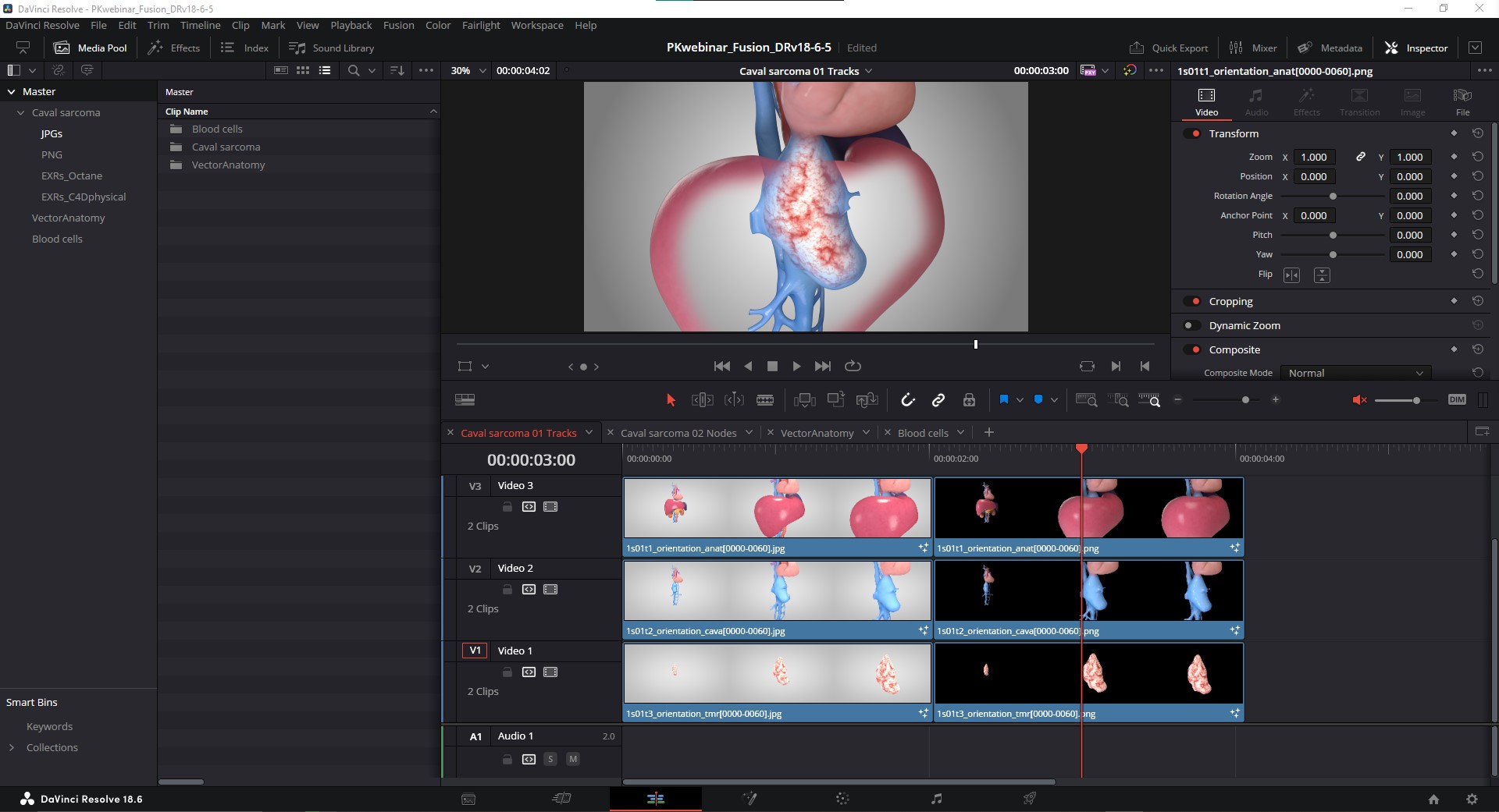
Because I’m using PNGs for this example, we don’t have to worry about applying alphas for a transparent BG, but we do want transparency for the middle of the liver and cava, and this will be achieved with masking in Fusion, just like the masks in AE.
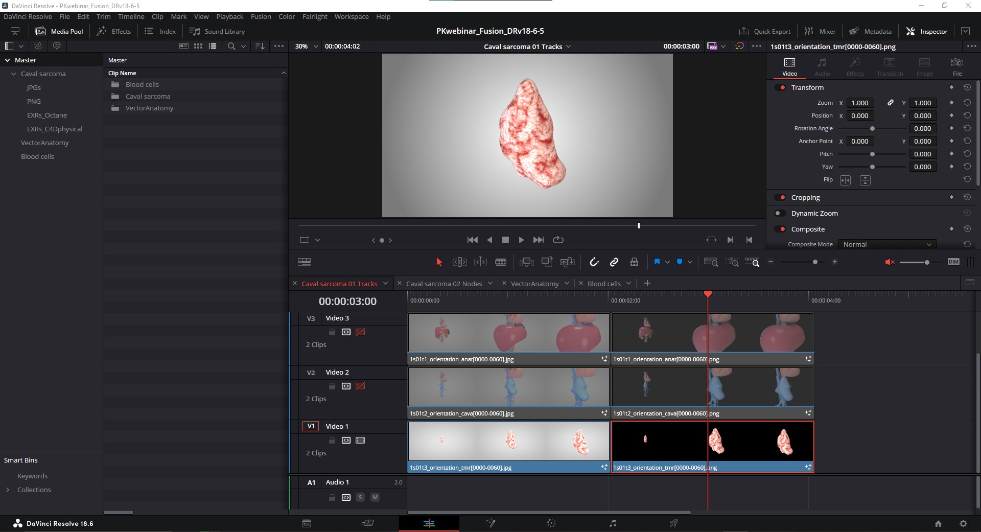
On the bottom-most track, we’ll want a custom background, so let’s start our adventure with nodes there! The first thing I need to do is turn off the top 2 tracks, because when I navigate over to the Fusion node page, it’s going to show me the nodes associated with whatever is the top-most track. We can disable tracks by using (on PC) Ctrl+Shift+# of that track, or clicking the little filmstrip icon to the left of the tracks we want to disable.
NOTE: in order to disable the top-most tracks, so we need the filmstrip icon to turn red with a hashmark across it. If we “lock” the layer with the white lock icon on the far left, or use Alt+Shift+# to lock or deactivate the track, that’s not the same as disabling it, and the top-most track, even when locked, will still be the default location when we go into Fusion. This will make more sense later on, stick with me!
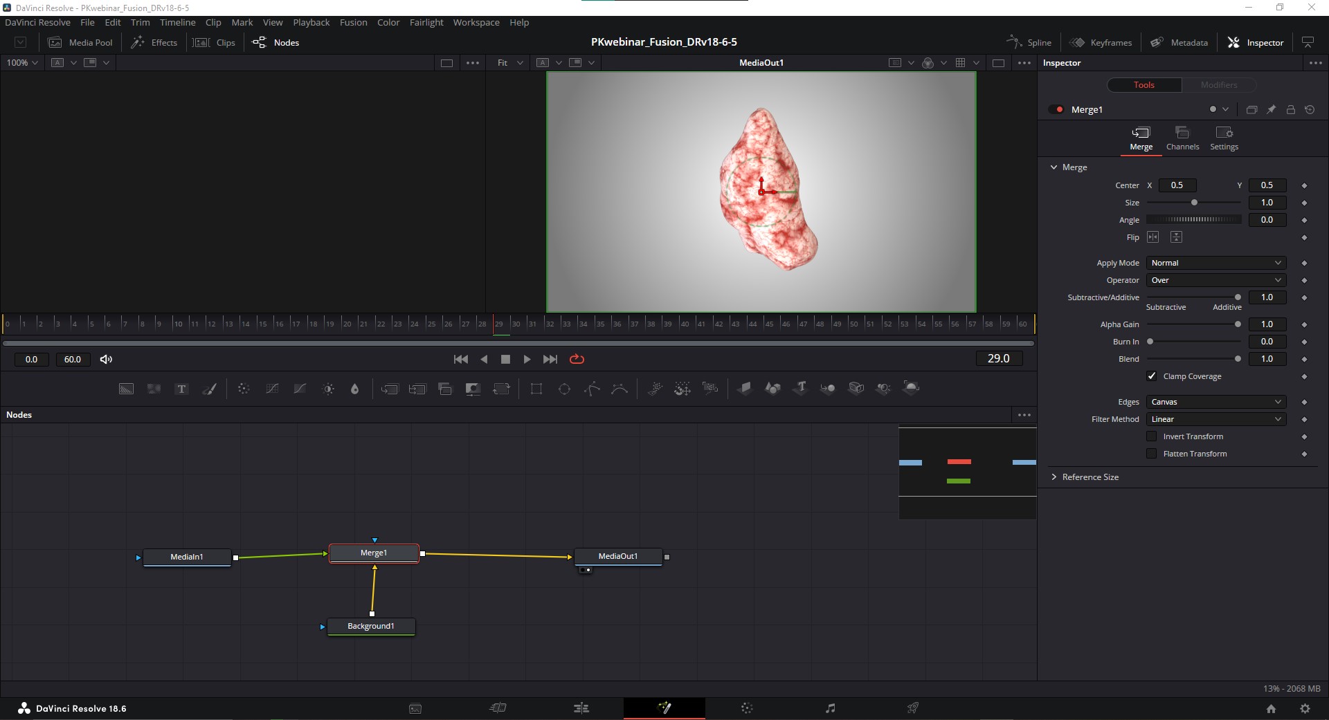
With only the bottom-most track active, I’ll navigate to the Fusion page using the magic wand icon along the bottom of our UI (you can also use the keyboard shortcut Shift+5), and we’ll check out some nodes! Inside of this node space we have 4 nodes. These are the most basic and important nodes you'll work with inside of Fusion: MediaIn nodes, Background nodes, Merge nodes, and a MediaOut node.
MediaIn NODES
When you drag a piece of media in from the Media Pool in the upper left, it will become a MediaIn node here in the Fusion workspace. You can hit ‘F2’ to rename any node. I’m also going to press the #1 key on my keyboard to bring up this node in the upper left viewer. I’ll select the MediaOut node and hit #2 key on my keyboard to bring up this node in the upper right viewer. If you’ve ever used Premiere Pro or similar video editing software, you might be familiar with this dual monitor layout. Usually the left viewer is for Sources, i.e. raw video or other assets, and the right viewer is for your edit, or active Timeline. In Fusion we can assign these 2 viewers to any node in our workspace using the 1 and 2 number keys on your keyboard. We’ll know which node is being viewed in which monitor when a dot is active in the lower left corner of a node.
Background NODES
The Background node is very similar to a Solid layer in After Effects. It can be a flat colour, or, you can adjust its parameters to be a gradient, as I've done by adjusting its attributes in the Inspector panel in the upper right. Background nodes can also be set to be 100% transparent, with their resolution dimensions determining the resolution for the whole node tree (set in Tools > Image parameters). This is important because the first node in a network sets the resolution for the whole comp (more on this later).
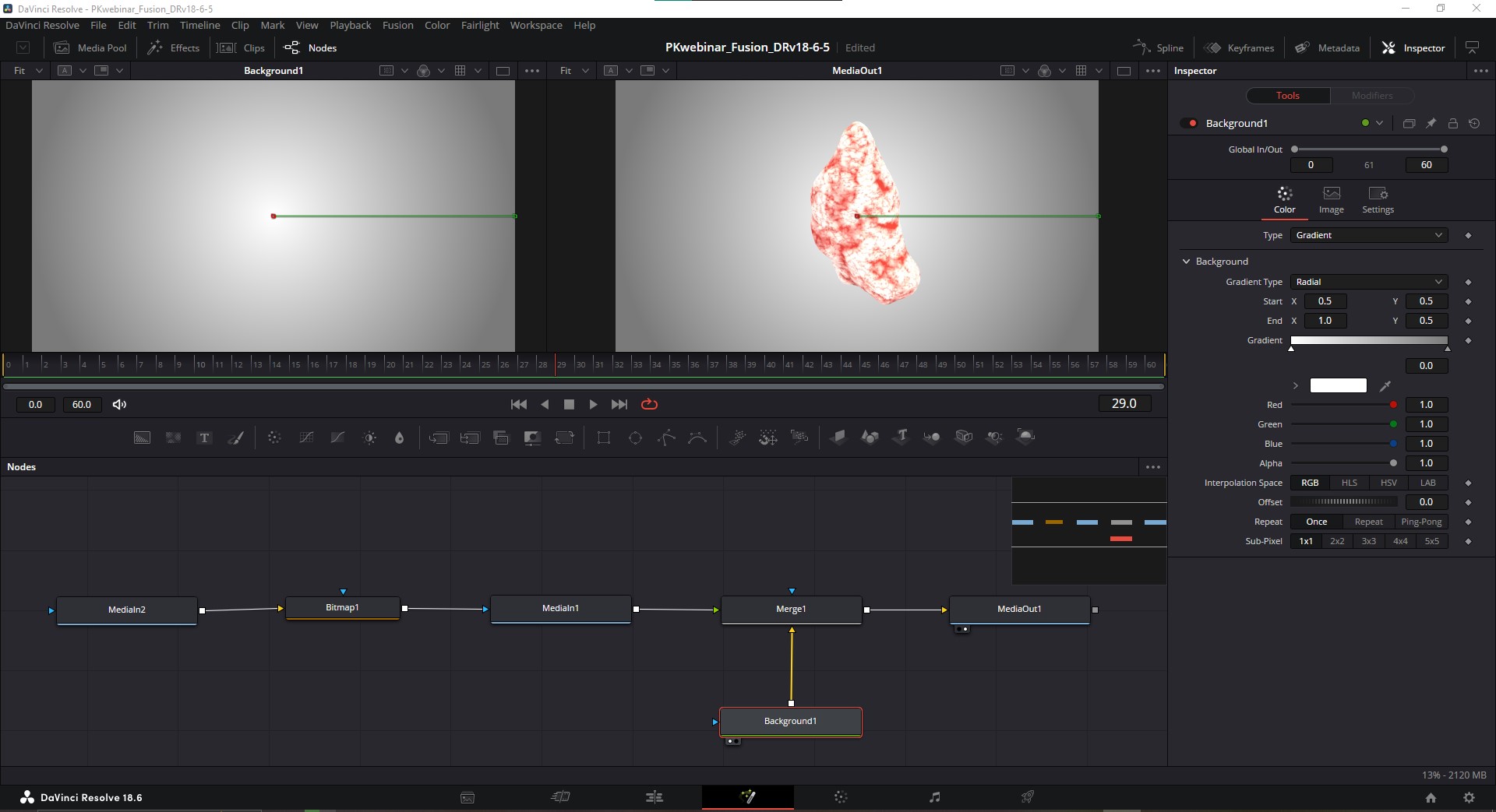
These two nodes, the MediaIn and Background node, are combined using a Merge node, which also allows us to set the blending mode (multiply/add/overlay/etc). So remember how I just said there are some exceptions to nodes only giving one instruction? The Merge node is the best example of these exceptions. It’s saying 2 things: “place this on top of that, in this way.”
Now is a good point to talk about node order. The order in which these nodes are placed and connected does matter to an extent, similar to how layers stacked on top of one another in AE matters, but in Fusion we have more flexibility. The position of the node in the Fusion nodespace doesn’t really matter, this means we can build node trees going vertically, horizontally, or cascading in a diagonal, but how they’re connected, and in what order, does matter. The coloured triangles on each node indicate the type of connection they are making. Yellow means primary, or background. Green means secondary, or foreground. Blue means a mask. We’ll cover this in more depth throughout this tutorial.
OK so the MediaIn node gets connected to the green input on the Merge node so that it lays on top of the Background node, which is connected to the yellow input on the Merge node. If we had connected this in reverse by accident, we can use Crtl+T (Cmd+T on Mac) to toggle these inputs and preview that, which is a useful keyboard shortcut to know, we’d see the background cover up the media with transparency. Not what we want, so let’s swap them back. Whenever you don’t see what you expect in your nodes, this is a good troubleshooting step to do.
Our bottom-most track is all set, we’ve got our tumour against a custom background. Now, we'll move to the next set of tracks and talk about masking.
Masking in Fusion
Let’s activate the next track up for the vena cava. With that track active in Fusion we have another simple node setup–we only have 3 nodes to consider–MediaIn and MediaOut nodes again, and a Polygon node which has been added for our mask. This gets plugged into the blue input of the MediaIn node. We have a few options for different masks that can be found in the Fusion node toolbar, I almost always use the Polygon mask. You just click and draw points, click-and-drag to make Bezier curves, and when you’re done you click the first point to close the shape. Once I've drawn the mask, we can set a keyframe by going to the Inspector (right hand side of UI), rt-click on the text at the bottom that says “Right-click here for shape animation”, and select “Set Key.” I’ll move to another frame and change the mask shape, and we’ll animate between the two using key frames.
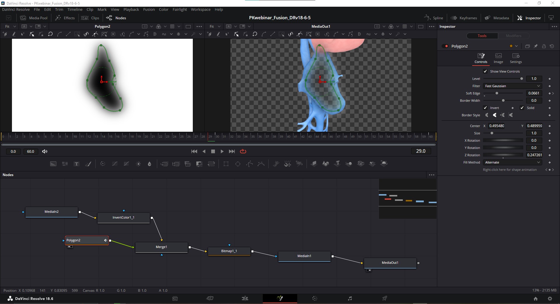
To adjust the shape of a Mask once you’ve drawn it, hit Shift+A to select all points, then hit Shift-B to bring up the bounding box and this gives us the controls to adjust the position and scale just like the Free Transform tool in Photoshop. Rotation is done with clicking on this dashed line circle around the gimbal. (Adjusting the pivot point can be a little funky at first, but basically you press and hold “T” for rotation, “S” for scale, “X” for horizontal scaling, “Y” for vertical scaling). Hit Shift+S to smooth out the handles.
Because we want this mask to animate with our rendered shot, we’ll add some keyframes and adjust its shape in sync with the render. With the Polygon mask node selected, Rt-click the text at the bottom of the Inspector that says “Right click here for shape animation” and choose “Set Key”. Navigate to another point on the timeline using the playback controls, or clicking in the Timeline, adjust the polygon mask shape, and a new keyframe will automatically be added.
In the Timeline in the center of the Fusion page, individual keyframes are indicated as single-pixel wide white lines, and we can’t really click and drag them (if we open up the “Keyframes” window from the upper right, we also get these thin little lines for the keyframes, not terribly helpful). For fine-tuning your keyframes and easing them, you’ll want to open up the “Spline” window with the button in the upper right of the UI. This will open over your node workspace. Here we can select specific elements we want to edit, we can adjust the timing on our key frames, and if we want to smooth out the animation curves we can use Shift+S to smooth them out, or Shift+F to flatten them, and then use the handles to play with the animation curves. One last little tip, if we hit “T” while in the Spline window, we get precise control over that easing.
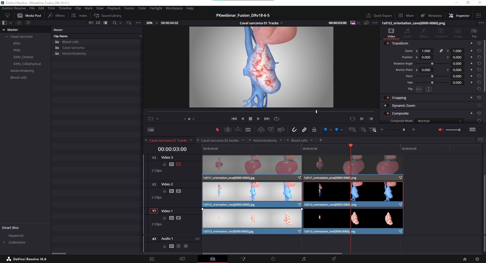
To finish off this composite, I’ll navigate back to the Edit page, activate the top-most track, and here we have the masked liver and surrounding anatomy. Now with that top-most track active, when we go back to the Fusion page it’s going to go to the nodes associated with this track.
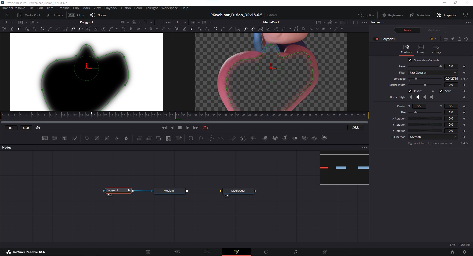
Then it’s much the same as the previous track, we have a Polygon node as a mask for our liver, and that is piped out to our MediaOut node. We could also try an Ellipse node in here to show how the mask is working, you can try this mask node out instead and see that it behaves a little differently than ellipse masks in AE. If we want an Ellipse with control points we can access, we can do it but only from the start, I don't think there’s a way to convert an Ellipse mask later. If we create a new Polygon node, don’t make any points yet but with the node selected, Rt-click in the Viewer and at the bottom of the context menu expand "Polygon#:Polyline" and choose Create -> Ellipse. This works the same for Rectangle masks as well.
So this is how we’d build that same shot, with 3 separate but overlapping takes, and masks, using the tracks in DaVinci Resolve in place of layers.
Compositing an alpha pass for JPGs
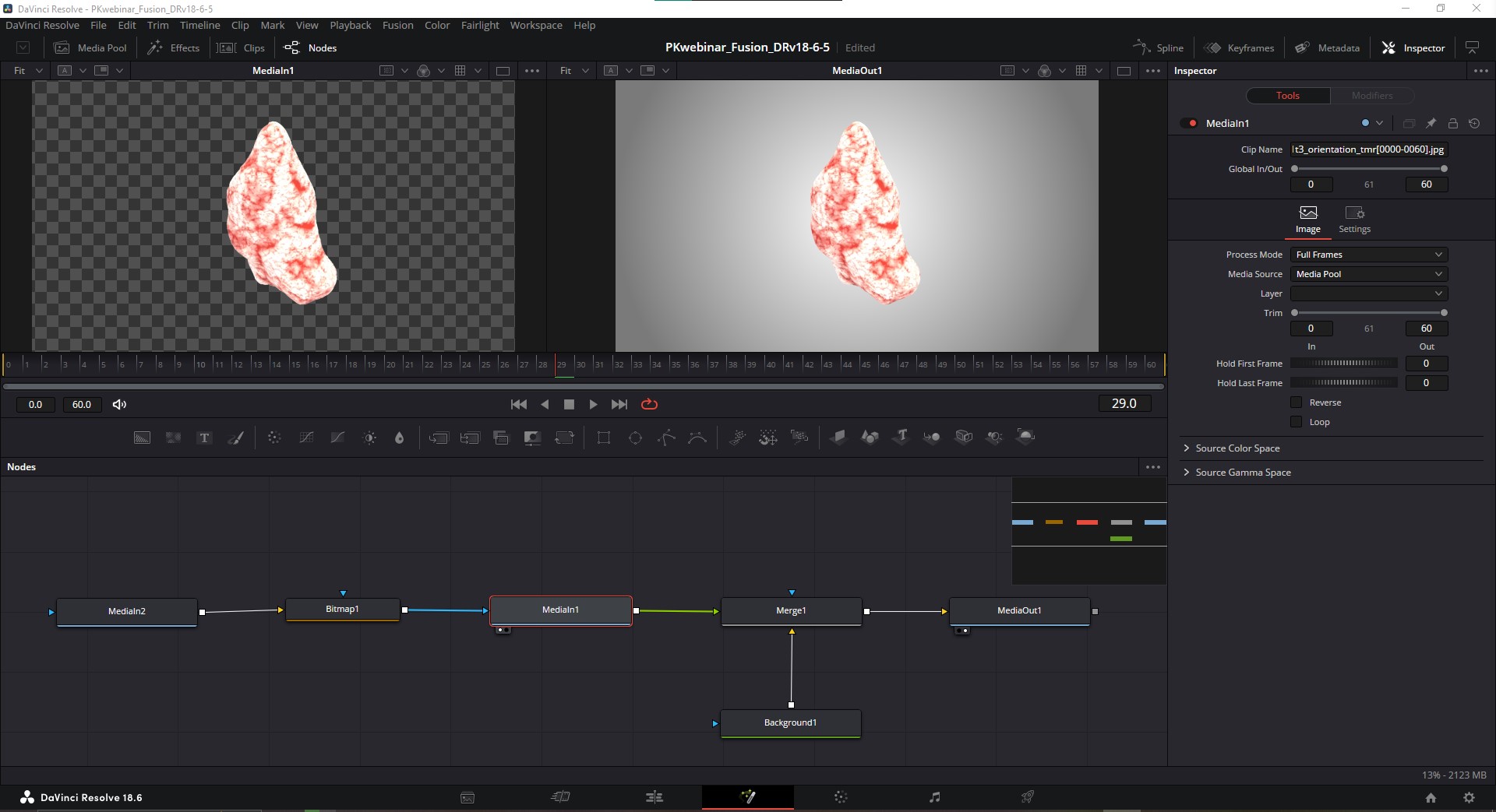
If we were working with JPGs instead of PNGs, we’d have to consider how to add an alpha pass so that we could get transparency behind our rendered objects for a custom background to show up. There’s an extra node we’ll have to add when we want to do this. If we tried to connect the MediaIn node of our alpha pass into the mask input (blue triangle) of our MediaIn node for the render, it wouldn’t work because Fusion doesn’t know we want the alpha pass to be interpreted as such, we have to tell it “this is an alpha pass”, and we do that with a Bitmap node. So the MediaIn for the alpha pass gets plugged into the yellow input of the Bitmap node, and the output of the Bitmap node gets plugged into the blue input of the MediaIn render pass node. The rest of the node tree works much the same.
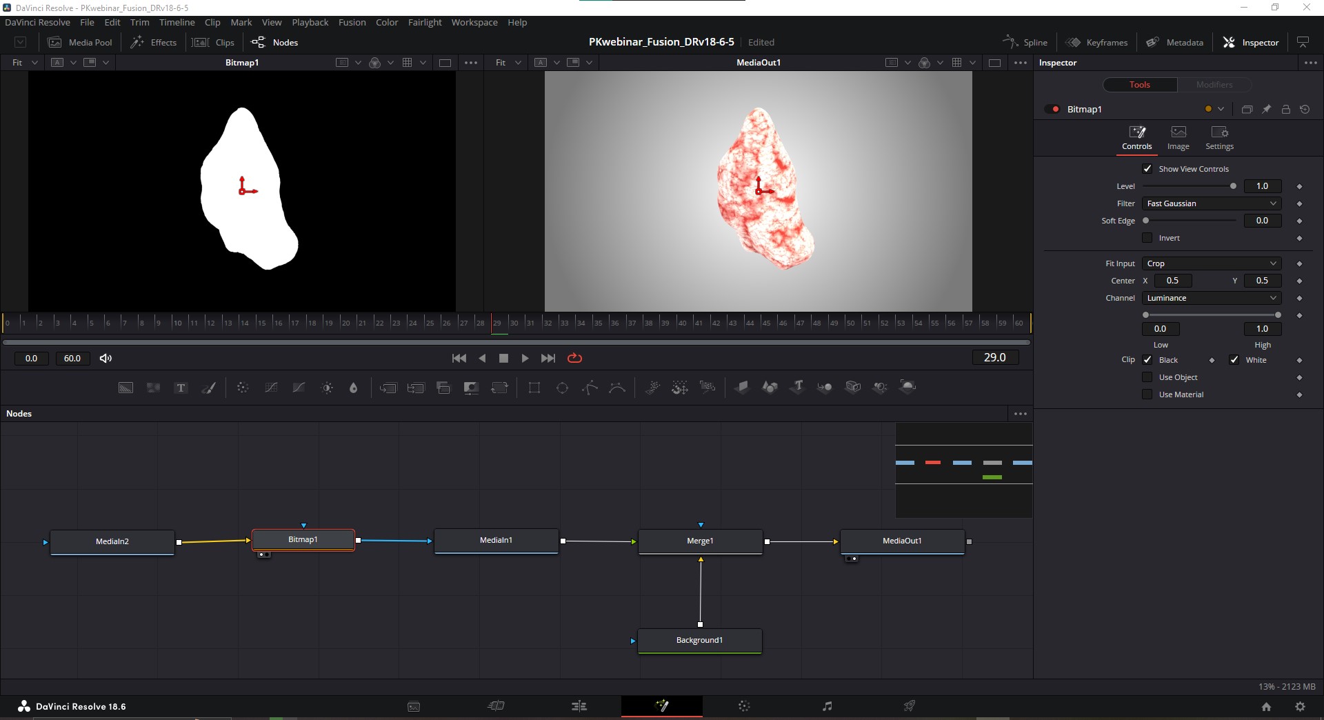
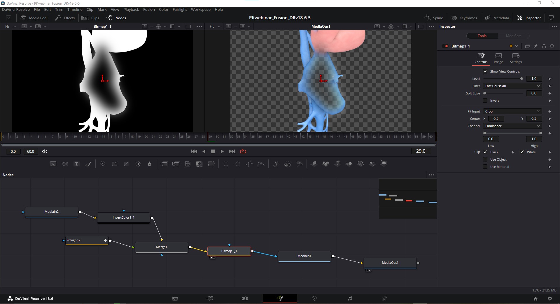
This does get more complicated though when we want to add the masks for the liver and cava. On those shots, we’d need to combine 2 alphas: the alpha pass and the polygon mask. We can achieve this using a Merge node, with its blending mode set to “Difference” and adding an “InvertColor” node between the alpha pass node and the Merge node. That merge then gets plugged into the Bitmap node, which can then be applied as a mask on the beauty pass node.
PART 3. BUILDING the DEMO SHOT with a SINGLE NODE NETWORK
From what we’ve seen so far, our example isn’t terribly different than how we’d set up a shot in AE, but we don’t have to build shots this way in DR, in fact, it’s kind of less efficient and not taking full advantage of what this software offers, so let’s look at how we can do this better.
A great benefit to doing our compositing using nodes is that we can arrange our clips on our timeline all on one track, so we don’t have to scroll up and down to see every individual clip like we do in AE, which saves a lot of screen real estate.
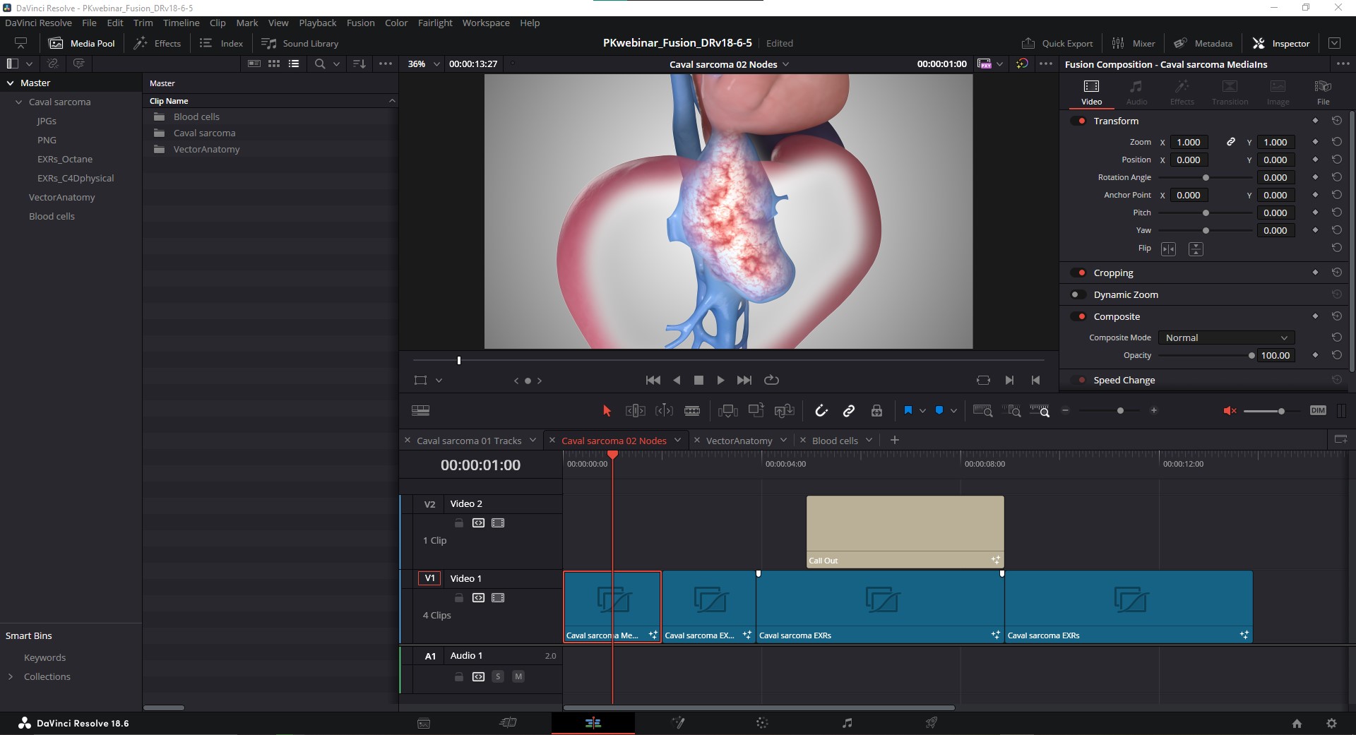
Shown above you can see I've got one track with all my compositing being done in one clip. What I’ve done is combined all three of those individual takes into 1 node tree, which are embedded in Fusion clips. You can create Fusion clips by going to Clip > New Fusion Clip..., or, Rt-click on your Timeline and choose New Fusion Clip...
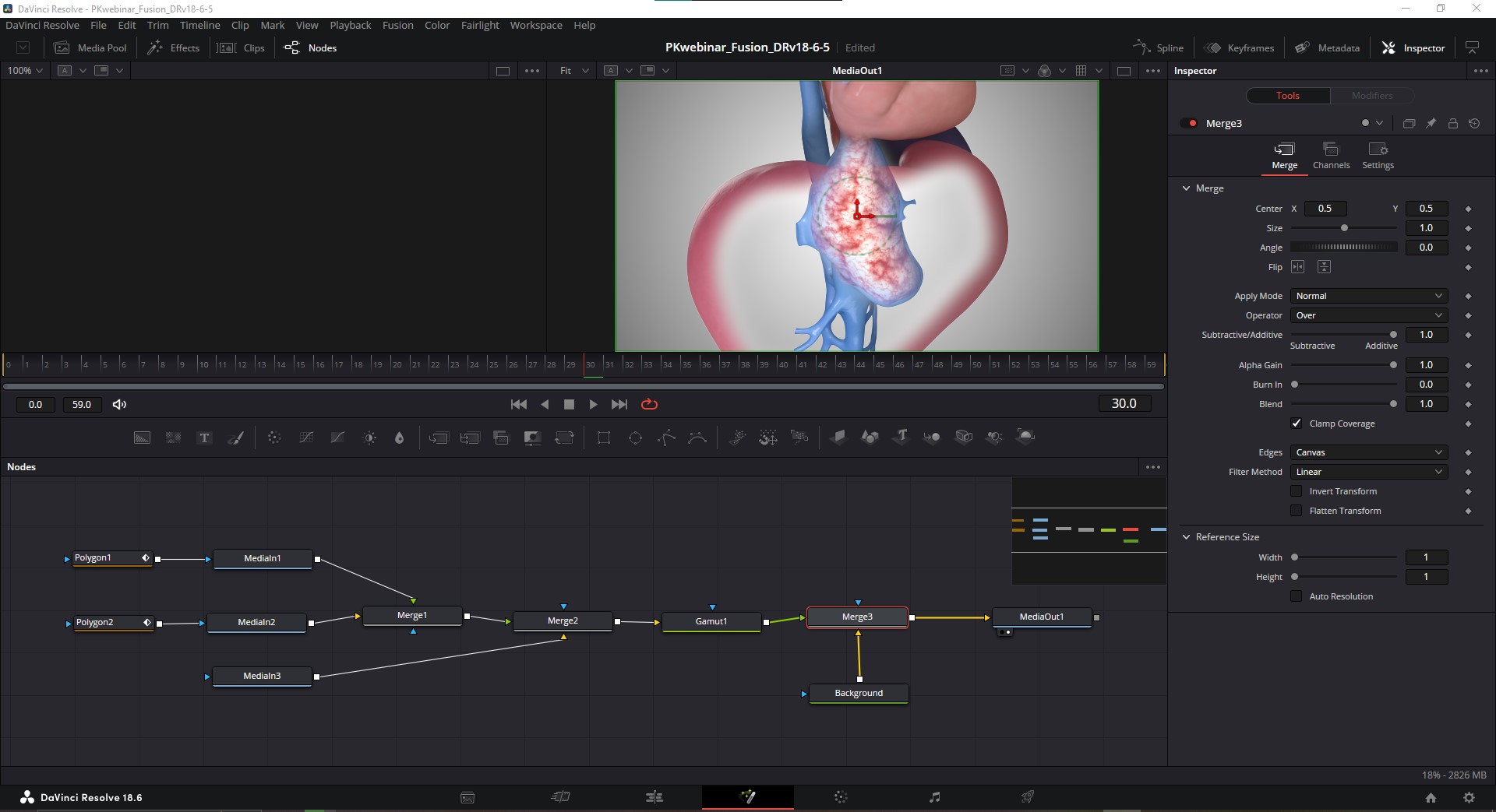
Node trees can get big enough that you might want to zoom out on the nodes, so to do so, use Crtl+mouse scroll wheel on PC, or Cmd+mouse scroll wheel on Mac. You can also click and drag with MMB to pan around the node space. If you hit “V” it will toggle the little navigator window in the upper right. Lastly, if you really want the most space to work with, you can go to Workspace and uncheck “Show Page Navigation” but I usually leave the page icons active.
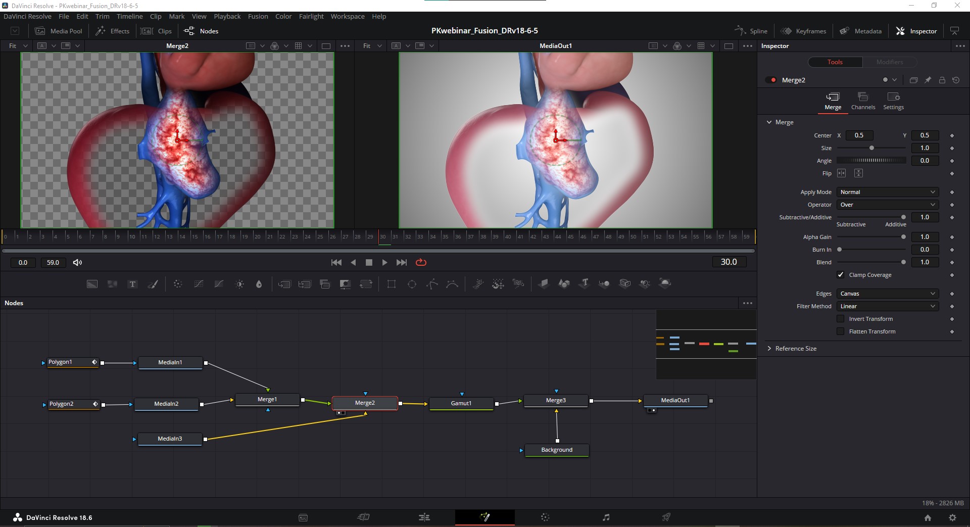
Shown here are all 3 takes combined into 1 node network. We now have 3 MediaIn nodes, one for each take, which were renamed by hitting "F2" for organization sake.
I copy+pasted the same Polygon mask nodes used from the PNG example into this node workspace, and connected them to the blue triangle inputs on their respective MediaIn nodes. Here’s where we put our knowledge of Merge nodes and input order to work. Starting with our top-most shot, the full anatomy, we've plugged it into the green triangle of the Merge node, and then the cava, which we want to see “inside” the liver, is beneath that shot by plugging it into the yellow input of the Merge. So now, Merge 1 represents the full anatomy with its mask, and the cava with its mask combined.
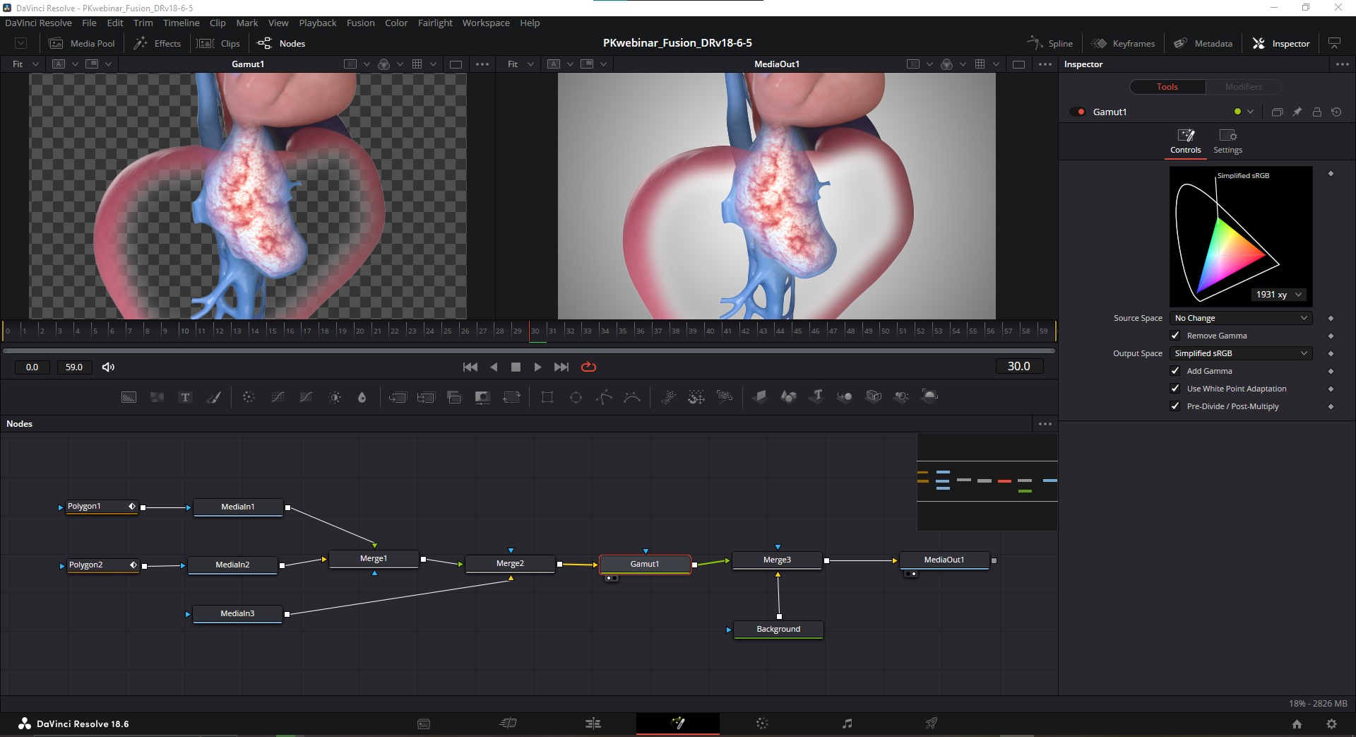
Setting Colorspace
After merging the 3 shots, we need to adjust their colorspace into sRGB for rendering out, so to do that we use a Gamut node. These shots were rendered using Linear sRBG, and we can leave the Source Space in the Gamut node to “No Change,” but by changing the Output Space to Simplified sRGB, we get the colors to look as intended. I should mention at this point that there’s this little checkbox at the bottom of this node that says “Pre-Divide / Post-Multiply” and you definitely want that checked ON. If you don’t you’re going to get some strange things happening with regards to blending modes or transparency. I’m not going to attempt to explain what this does, but there’s a video I’ve provided a link to in the Resources at the end of this doc that explains it in depth. Just know that if you ever have issues related to transparency or blending modes, look through your nodes for this checkbox and make sure it’s on.
A final Background node is added beneath our merged and color-corrected shots, and sent to the MediaOut node so it can be viewed on the Timeline. There we have it, all 3 shots combined into 1 node network. We’ve now covered all the basics of building shots with nodes!
RENDER PASS COMPOSITING with NODES
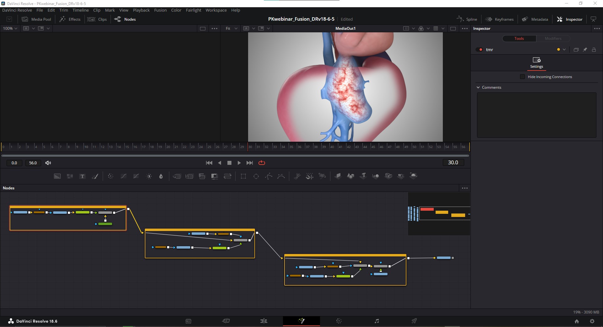
In the next example, we are essentially accomplishing the same task with 3 separate takes being combined into 1 shot. But now I’ve condensed all the nodes for each individual take using node groups (Cmd/Ctrl+G to create a group, Cmd/Ctrl+E to open/close them).
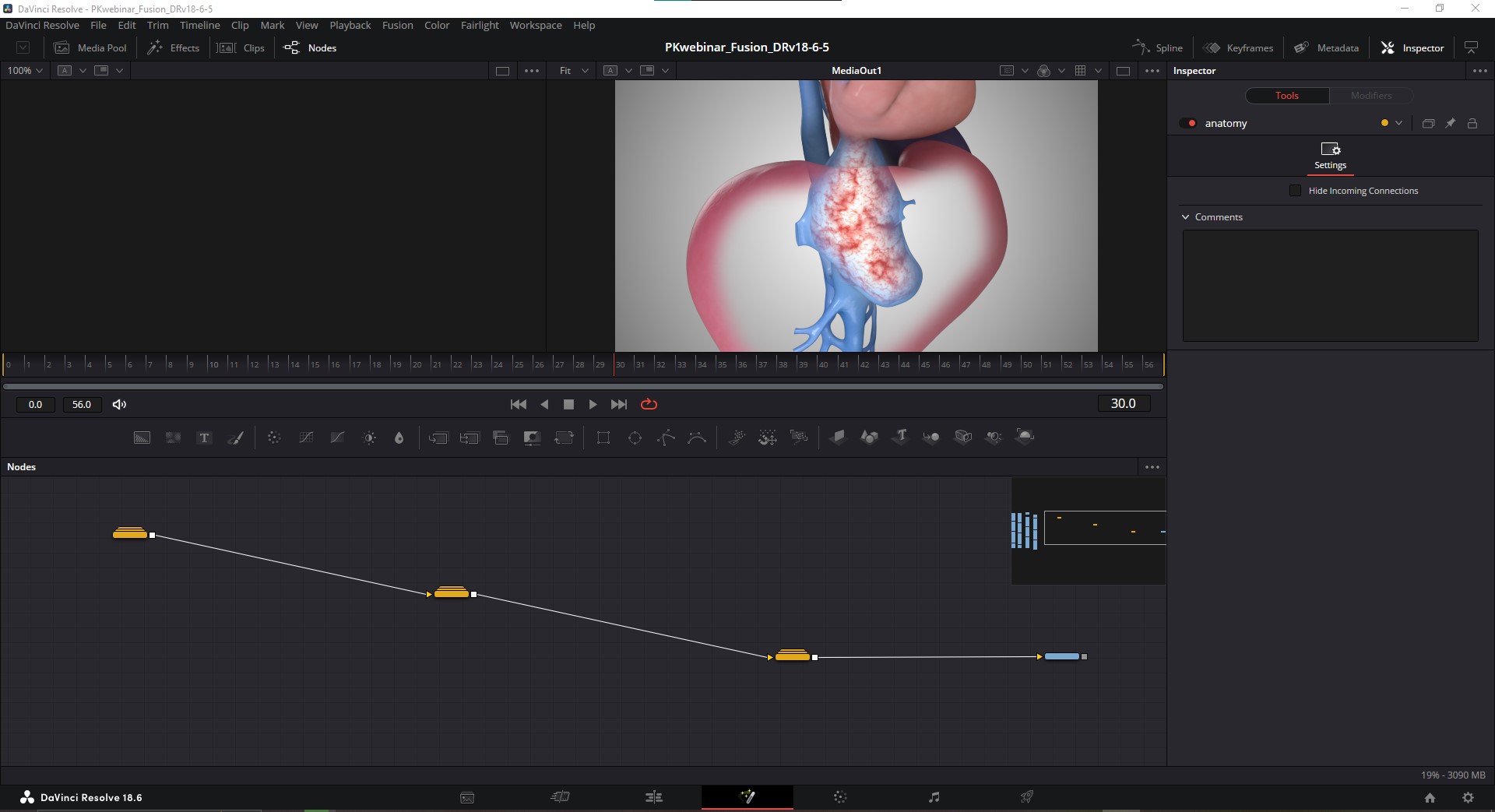
If we click and drag in an image series from the Media Pool as we’ve been doing, we get MediaIn nodes that don't give us access to the render passes within the EXR files, but, if instead we import using a Loader node (Cmd/Ctrl+spacebar > Loader > ...select media in Finder) we get a Media node with the name of the image sequence instead of the generic "MediaIn". This node is special, this is different. Now we have a node we can open up to get our render passes, you'll just need to have the hos_splitEXR plugin to do so. Rt-click on the loaded image sequence node, go to Script > hos_splitEXR_Ultra and you will get an import window with a few options, click “Run and Close” and the render passes will be imported as separate nodes.
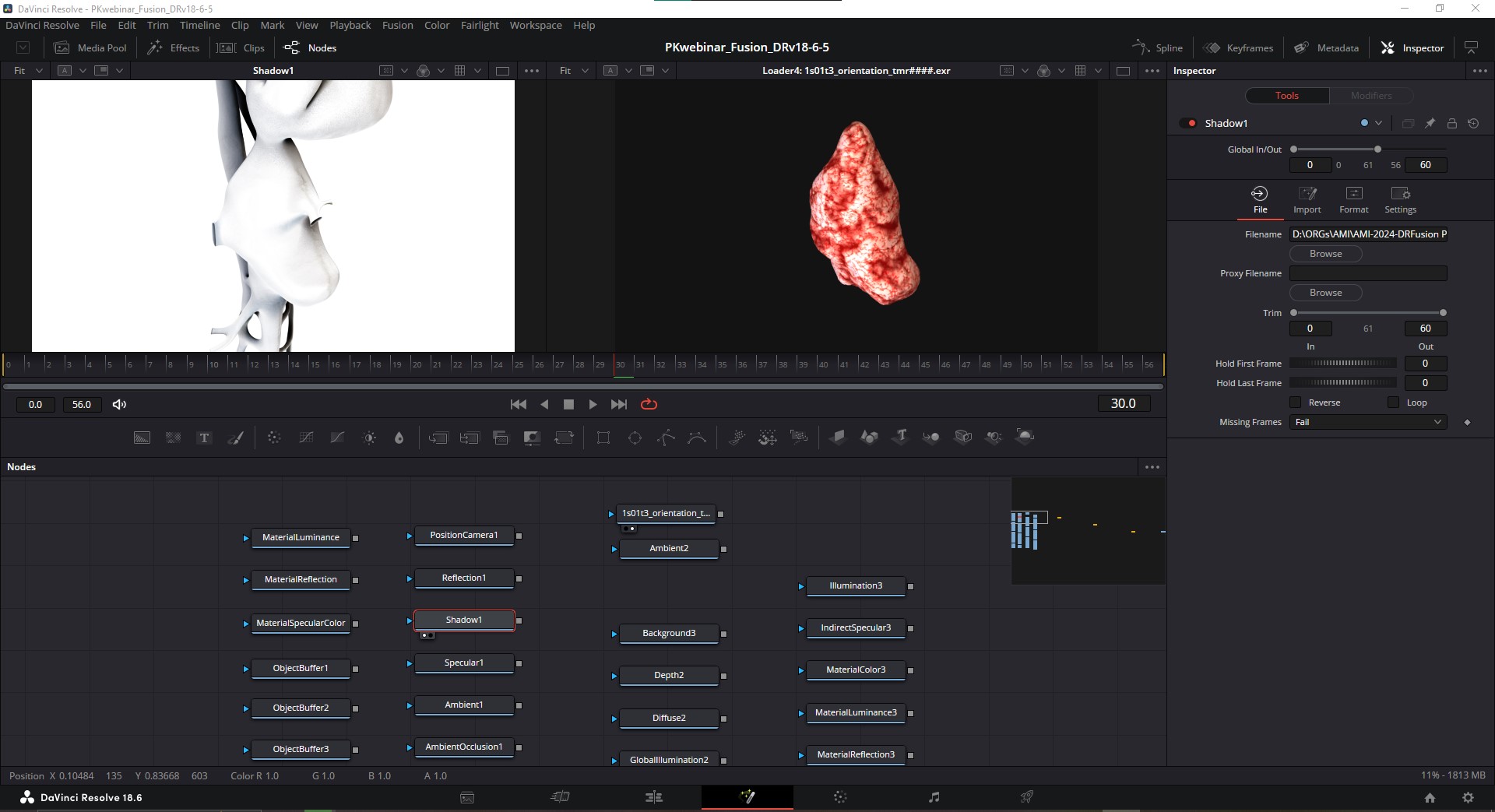
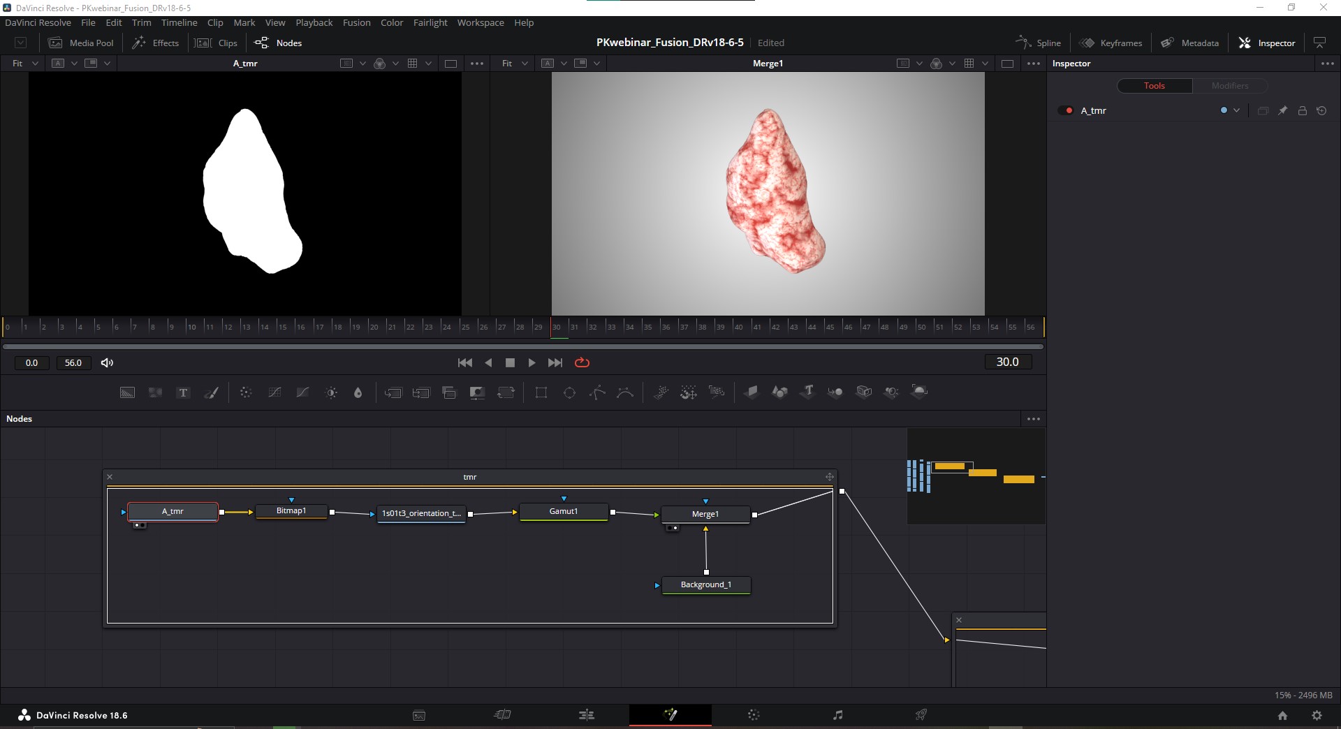
I’ll open up the first of these node groups and we’ll have a look at each take separately. For the bottom-most take, the tumour, I’m converting the alpha pass using a bitmap node so that we can apply it as a mask, converting the colorspace, and merging that with a background.
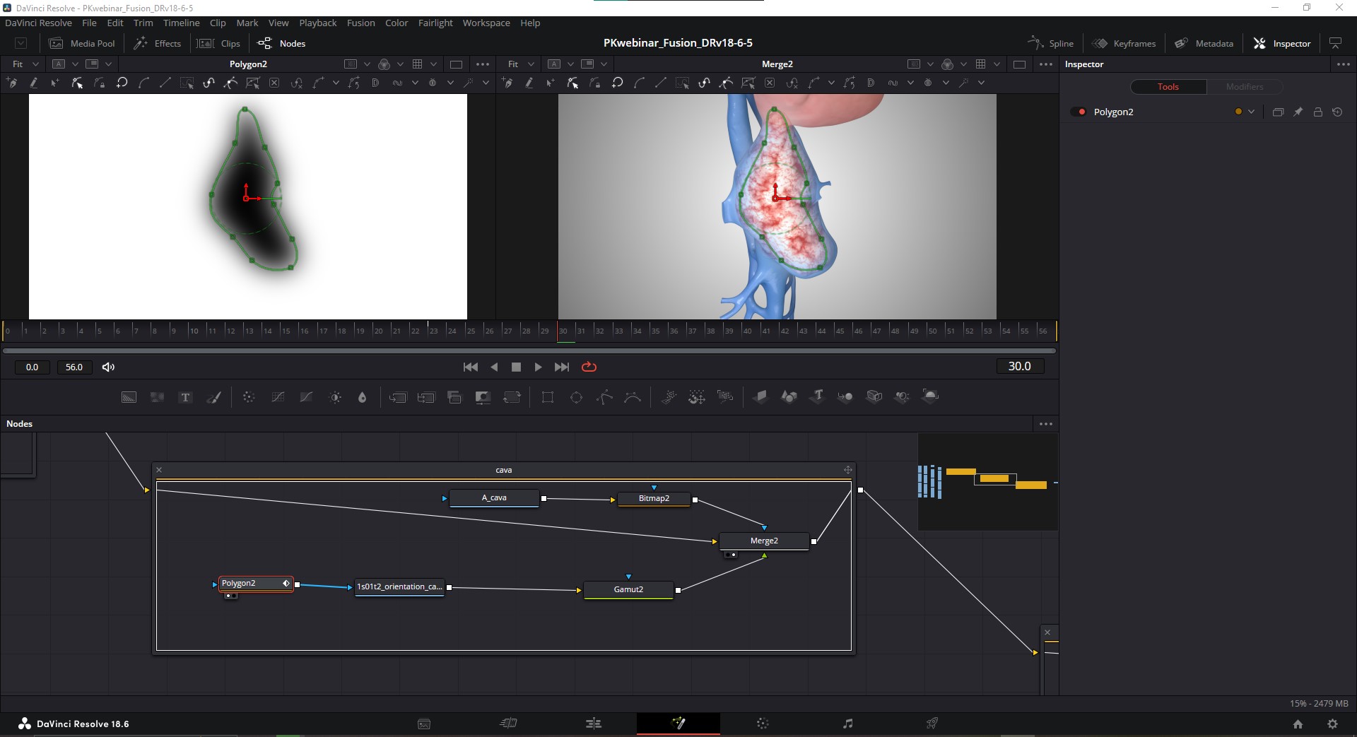
In the second node group, I’m doing the same thing for the vena cava–I’m applying the cava alpha and its Bitmap conversion node to the Merge node so that we get transparency for the background, and transparency in the center to reveal the tumour inside.
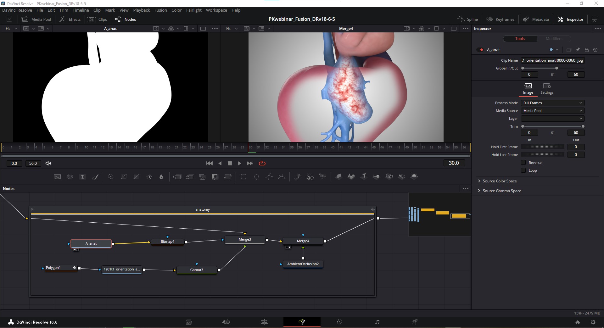
In the last node group, for the full anatomy take, we have the polygon mask on our render, which is then color converted. We have the alpha pass node which is converted to a Bitmap, that’s acting as a mask on the Merge node that connects the full anatomy with the cava and tumour. Finally, I decided to make use of one of my render passes and merged an AO pass to help visually distinguish what’s inside and outside of the liver.
So to recap, again we’ve combined all 3 takes into 1 shot, only this time, we’ve done so using individual render passes as opposed to MediaIn nodes, and created node groups for each take. I won’t go any further into render pass compositing because I think that’s more of an individual aesthetic, but hopefully now you can see how you’d do that. It’s mostly using Merge nodes to layer up passes and set their blending mode, and adding any adjustments you may want with color corrector nodes or other effects. Let’s move on and talk about compositing 2D elements and motion graphics.
PART 4. 2D MOTION GRAPHICS
Now that we have our shot composited, let’s look at how we’d use this asset to tell a bit more about our surgical story. Let’s start with the most basic, but necessary text elements for any teaching video: a label.
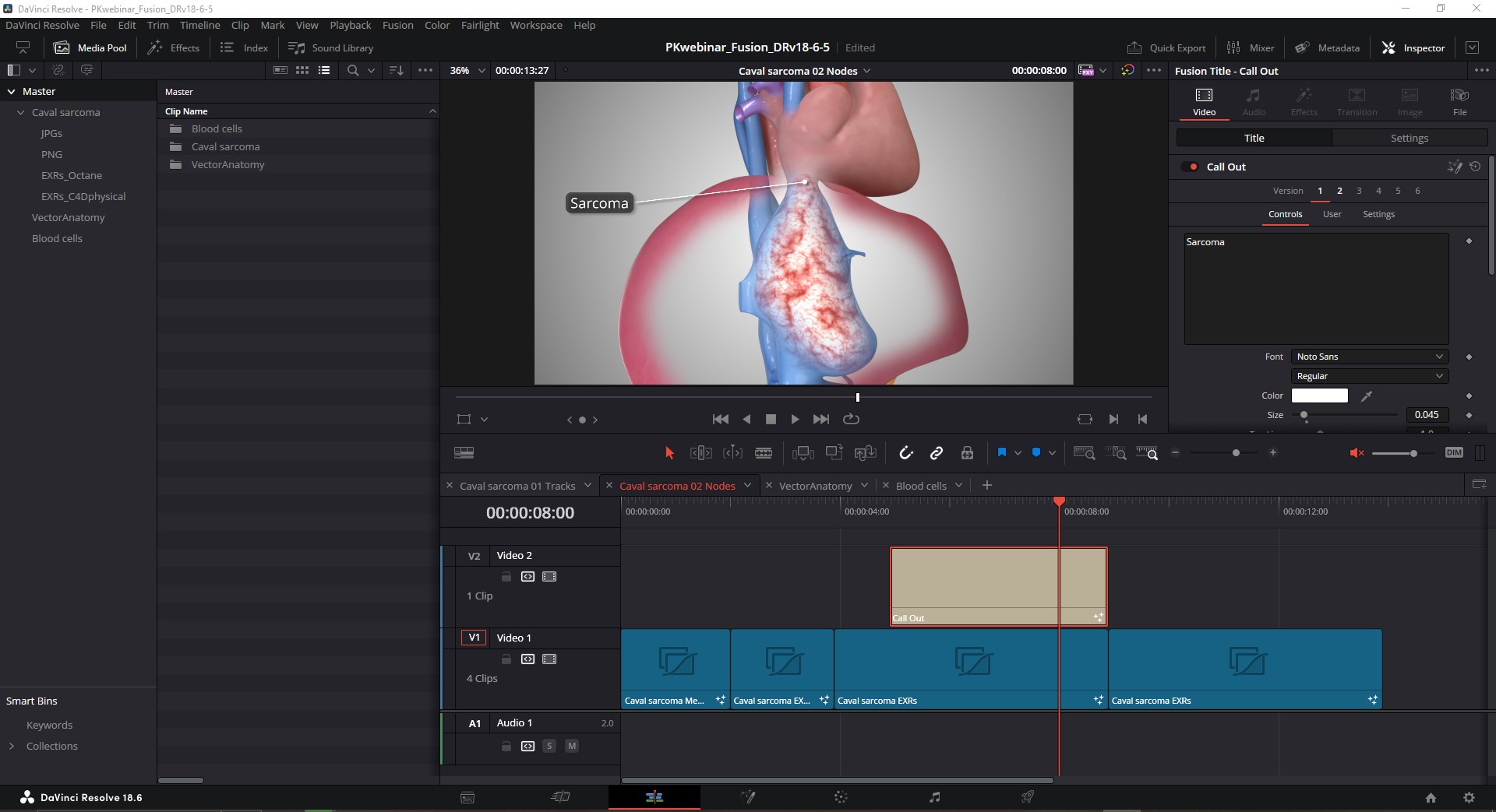
DaVinci Resolve comes packaged with a TON of free, ready-to-use templates for text elements. If we go to the upper left corner of our UI in the Edit page, Open up the Toolbox and go to Titles, we’ve got all these awesome presets to play with. I’m going to grab this “Call Out” preset and drag it onto our Timeline on the track above our Fusion comps. The “Call Out” preset is great for making labels, but the default settings don’t look all that great. That’s OK, because this preset is just a set of nodes, and now we know a thing or two about nodes.
Text+ NODE
With the “Call Out” clip highlighted, let’s jump over to Fusion, and we see there’s just this one node group attached to a MediaOut node. Open up the node group for the "CallOut" effect, and navigate to the "Text1_5" node, which is actually a Text+ node that’s been renamed for the preset. Click on it, and in the Inspector, we'll see options for updating the style of the node such as fonts, etc. I actually made an entire blog post on TVASurg for specifically this, so feel free to check that out later, for now, let’s just slap a DropShadow on it and check out some other cool stuff.
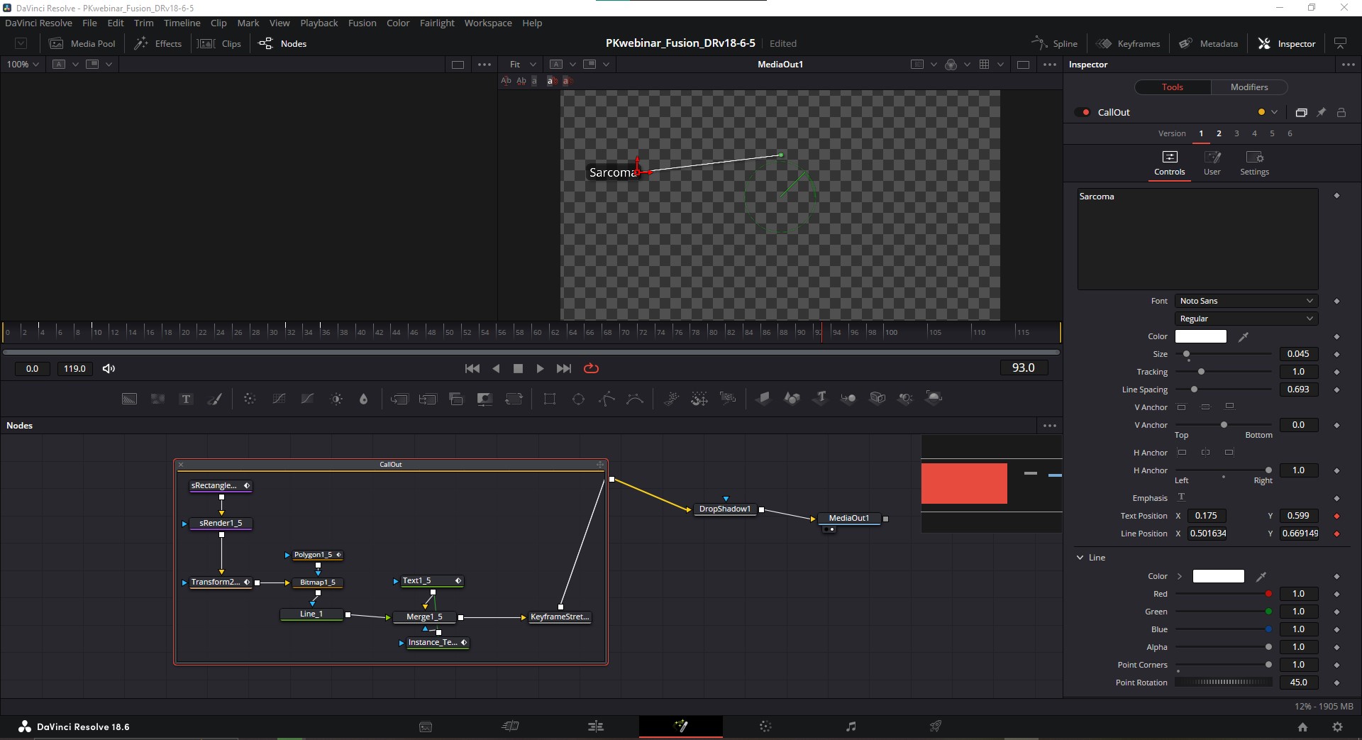
Now once I’m happy with my adjustments to the Call Out label, I can also copy+paste it into the same Fusion Comp as my takes. Not only is this convenient to be able to see all our nodes in one place, it’s also kind of necessary if we want to place the tip of our leader line precisely and compose the placement of the label.
TimeStretcher NODE
There’s something else we need to do here, which is to set a freeze frame on our render, because right now it’s still being interpreted as an animated clip. To accomplish that, I’ll use the TimeStretcher node. The TimeStretcher node allows us to hold a "freeze frame" when working with nodes that have animation. Simply indicate the frame # you want to be held in the "Source Time" of this node's attributes in the Inspector and make sure the gray diamond icon to the right becomes red.
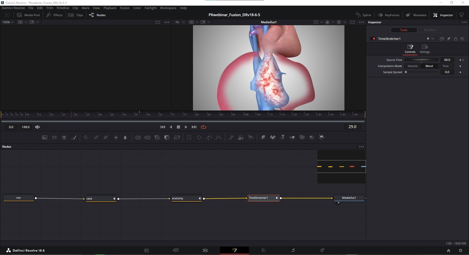
When I add the CallOut label to this node network, I’ll just need to make sure it’s placed after that TimeStretcher node, so that it doesn’t get held as a freeze frame as well. I want the 3-layer animated clip to be held as a freeze frame, and then I want to animate a label on top of that freeze frame.
Importing Vector Graphics
Now let's look at importing and animating vector graphics that may have been constructed in another software like Adobe Illustrator or Affinity Designer. I need to mention that when you are exporting an SVG file from Illustrator, it is CRITICAL that you do not check "Preserve illustrator editing capabilities". If this is checked on, DR will not import it. I’ve also found that there can be some distortions with the scaling of a vector image, but a method I’ve found to avoid that is to save your vector with an Artboard that matches the dimensions of your video Timeline in Resolve. So if we want full HD video, 1920 x1080, we’d set our Artboard for those dimensions. We can do vertical videos in DaVinci Resolve as well, so 1080 x 1920, or 1080 x 1350. Just set those as your Artboard dimensions in Illustrator or whatever vector program you’re using when you export and that should avoid problems with scaling.
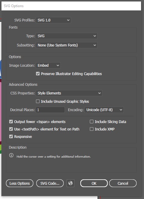
Once that SVG has been saved, we’ll import it by going to the Fusion menu at the very top of the UI, go to Import > SVG… You should see a window pop up that lets you set the dimensions, I recommend keeping them as they are, and just click “OK”. This brings in a new node group into our Fusion workspace, and if we open it up, we’ll see that DaVinci Resolve has automatically made a node network for us using an excessive number of nodes, but at least they’re ones we’re already familiar with: Polygon nodes, Background nodes, and Merge nodes.
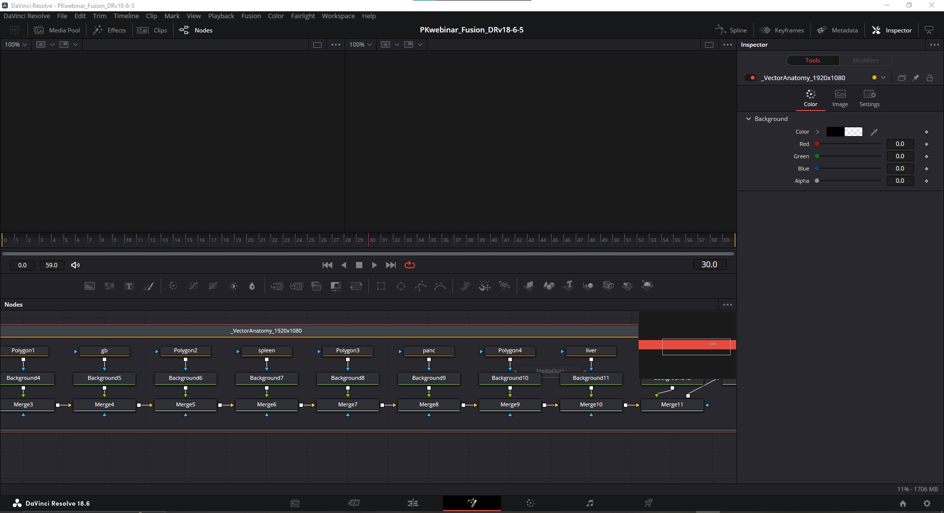
Each shape from Illustrator has been broken into 2 node pairs of a Polygon and Background node for the fill, and a Polygon and Background node for the stroke of each element in the original file. These are then connected to each other in series using Merge nodes. This is going to be a problem for us when we go to animate because we want to arrange these so that we only have 1 Polyline node for each object that controls both the stroke and fill, so we'll need to make some changes here.
Vector path animation
Setting this up for animation is a bit more trouble than I’d like but it is possible inside of Fusion (some of these issues may get fixed in future versions of DaVinci Resolve. For example, as of this writing DaVinci Resolve 19 is currently available in Beta). What I’ve done in this node comp is show you the steps I went through while learning how to combine the stroke and fill. Let’s go to the far left of these nodes and look at the Cava first.
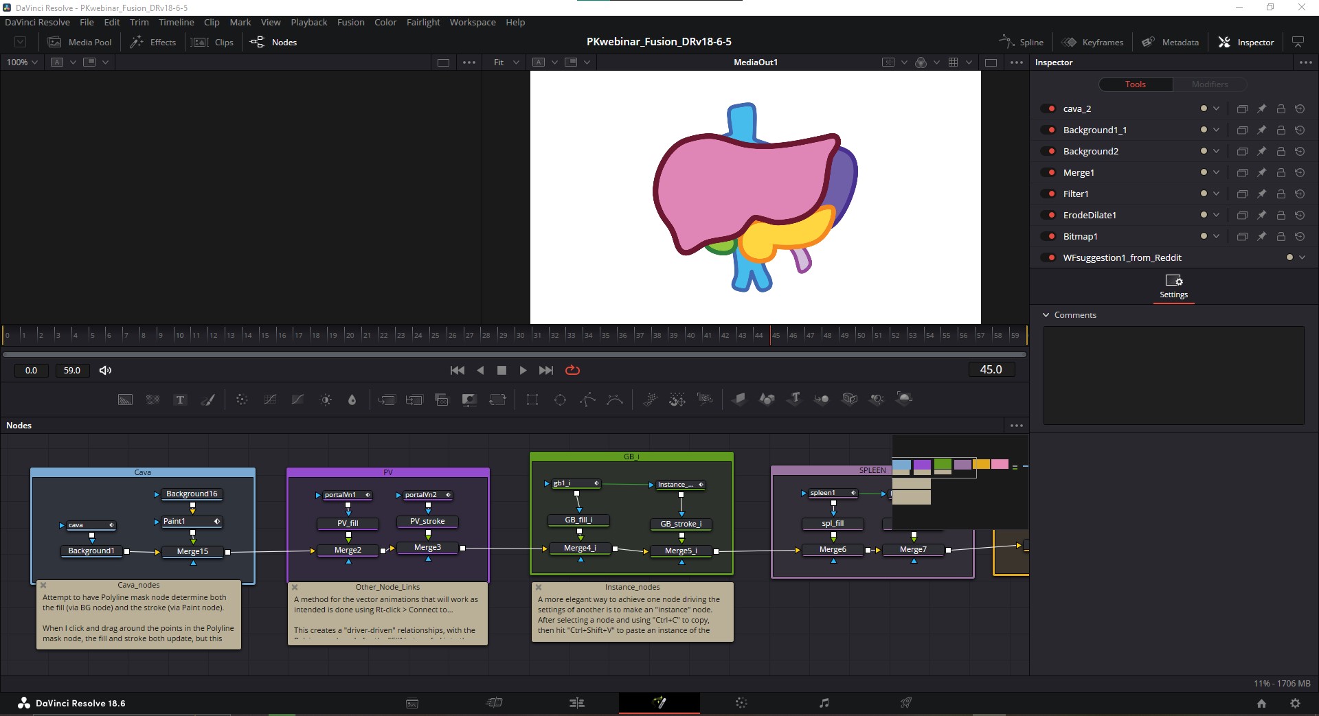
These nodes can be grouped using Underlays instead of Group nodes. The Underlay lets you drag nodes in and out of them freely whereas the group node doesn’t. The advantage of the group node is you can condense it whereas with underlays you can’t.
In my first attempt to have a Polyline mask node determine both the fill (via BG node) and the stroke, I used a Paint node to draw the stroke, and it’s referencing the Polygon mask node used for the fill. When I click and drag around the points in the Polyline mask node, the fill and stroke both update together, but this relationship doesn't carry over when I start adding KFs.
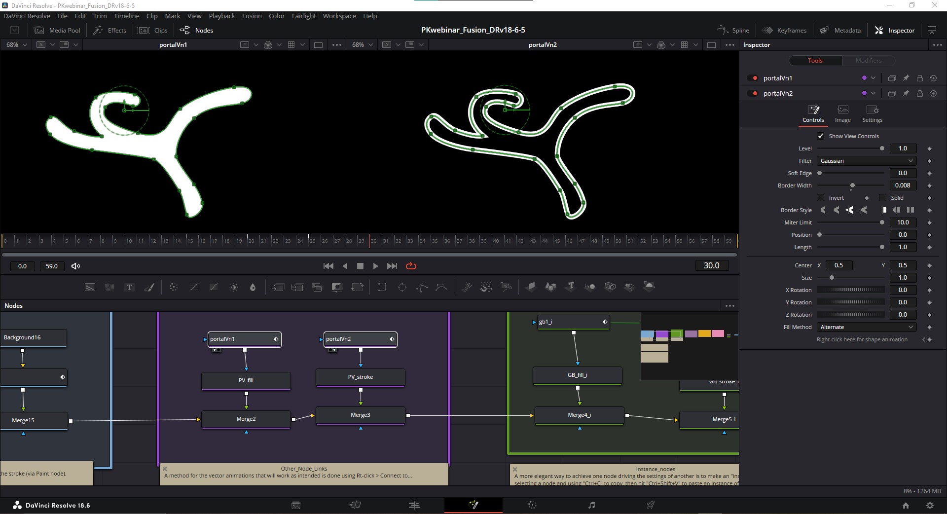
In my next attempt, I found a method for the vector animations that will work as intended. There’s functionality inside of Fusion to create "driver-driven" relationships by using Rt-click > Connect to… in a node’s attributes in the Inspector. So I used that with the Polyine mask node for the "fill" and connected it into the corresponding KFs of the Polyine mask node for the "stroke." This accomplishes our goal, but it requires two separate polygon nodes, which is cumbersome and creates room for error.
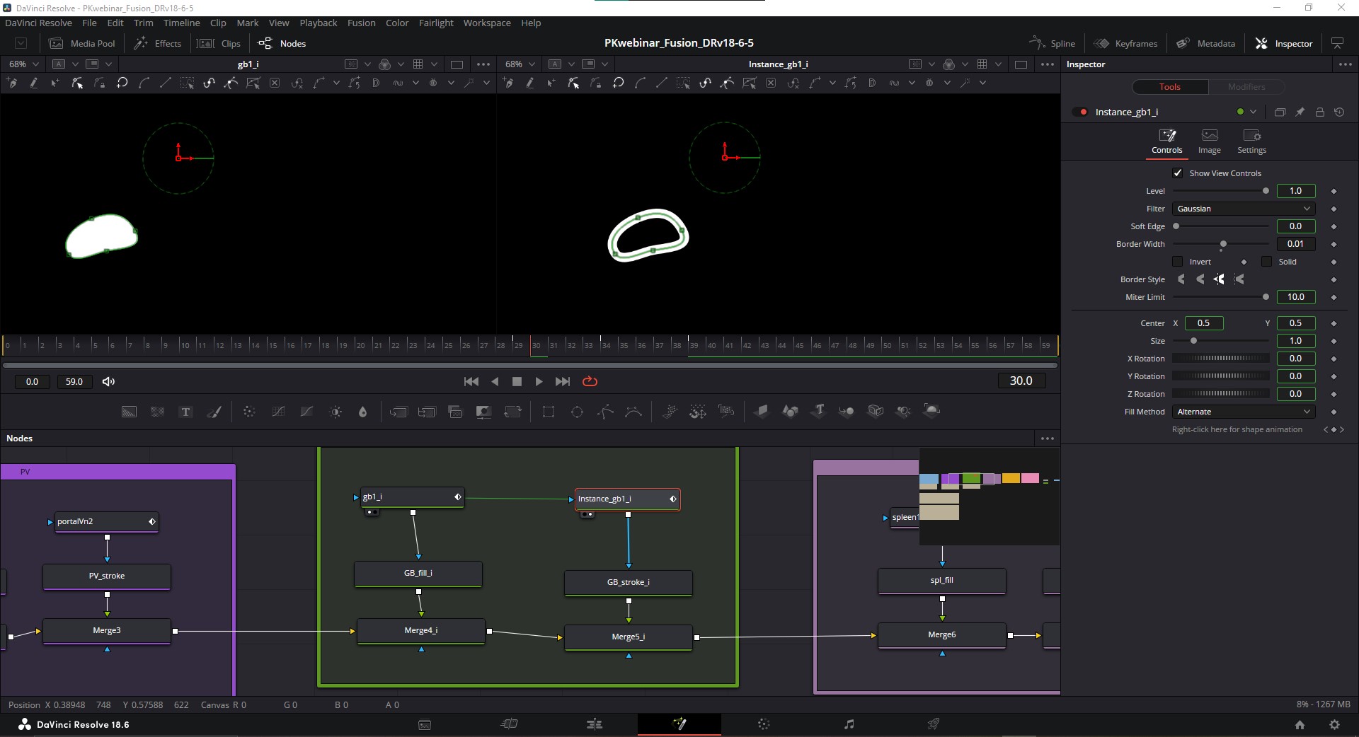
A more elegant way to achieve one node driving the settings of another is to make an "instance" node. After selecting a node and using "Ctrl+C / Cmd+C" to copy, then hit "Ctrl+Shift+V / Cmd+Shift+V" to paste an instance of the node, which will be named as such and be connected to its origin node with a green line.
To "de-instance" specific attributes of the instance node (here we would want to make a change on the instance node so that "solid" is unchecked and the "Border Width" is different), simply Rt-click on that attribute and choose "Deinstance" and the green outline around that attribute's value box will disappear.
So there we go! Now we’ve got one polygon node driving the animation of the fill and stroke simultaneously. I went ahead and added some keyframes with some squash and stretch animations to give our anatomy an organic feel, and a blank white background at the end. The last thing I’ll add is some fine-tuning of these keyframes using the same techniques we used in the Masking section above.
PART 5. EXPORTING
One last step of course, we’ve got to export our final animation to a format for posting online. Luckily there’s not much to this, we’ll just navigate over to the “Delivery” page (Shift+8) and set our save path. In most instances, I’d recommend exporting to MP4 format with H.264 codec, leaving the encoder to "Native". Resolution can be 1280 x 720, or 1920 x 1080 for full HD.
We also have the option for rendering out vertical format videos which is great for social media. Speaking of which, there are social media presets if you scroll along the top of the Render Settings.
One last consideration but it’s important–for our “Quality” I’d recommend restricting it to 7,000 Kb/s or less. Higher if you want better quality but past 7k you get diminishing returns for larger files sizes. That’s it, then we click “Add to Render Queue” at the bottom, and over on the far right in the Render Queue, we render it out.
OK, I hope you enjoyed this tour of what DaVinci Resolve’s built-in Fusion can do. Please let us know if this was helpful, or if you have any questions, hit us up!
--Paul Kelly, TVASurg Team
RESOURCES
-
TVASurg tutorials:
-
Blackmagic Fusion training page
-
Casey Faris YT channel
-
JayAreTV website
-
Jake Wipp YT channel
-
Pre-Divide/Post-Multiply explained
-
Compositing with Resolve & Fusion: 3D Camera Import
-
Scripting in DaVinci Resolve Fusion
-
Creating scripts for DaVinci Resolve
-
Creating Rectangle and Ellipse masks with anchor points
-
Pivot Point Manipulation for Masks in DaVinci Resolve Fusion

